Inspiring reactions in just one screen
With clear goals and a dramatic presentation, dashboards drive conversations and build engagement around complex concepts.
The challenge:
Build a dynamic visualization that communicates at a glance how inaccurate and incomplete a customer’s data is compared to our verified, master data.
My team at Dun & Bradstreet built custom dashboards and reporting tools for sales engineers and account managers to visualize the power of cleansing and consolidating records against a master record set.
When you’re selling access to “Big Data”, there’s no product photography or app screenshots to build excitement around. You can’t just show a JSON blob and expect people to get excited.
Nor is it helpful to brag to a potential customer about the impeccable quality and breadth of your records; instead, you have to tell the story of how their data can be better. I designed and built a suite of data visualization tools for customer data; this is the story of the data quality profile dashboard.
Sketching out the data stories
Working with our solution architects who specialize in building custom data pipelines for customers, I broke down D&B‘s complex data cleansing and validation process into a series of stories to explain exactly how inaccurate and incomplete a customer’s data can be.
Each story became a small vignette, telling each chapter of a larger data narrative in a visually compelling and understandable way.
Taken as a whole, these vignettes illustrated how D&B data could correct errors, deduplicate rows, and fill in missing fields — and what that meant for the customer’s records. We used them in various reports and dashboards across our suite of tools for data analysis.
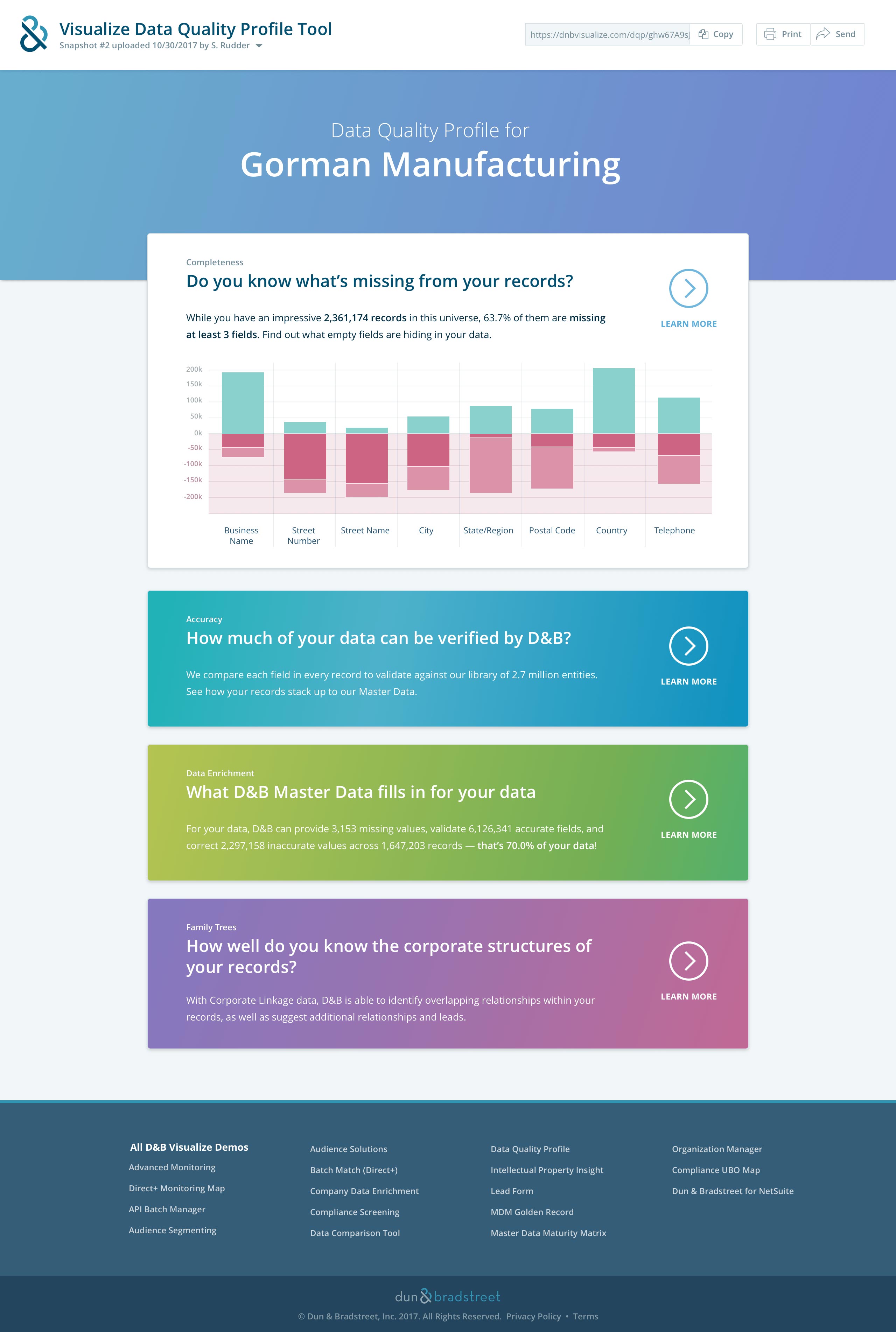
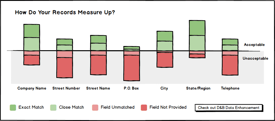
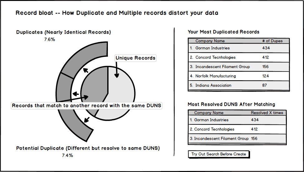
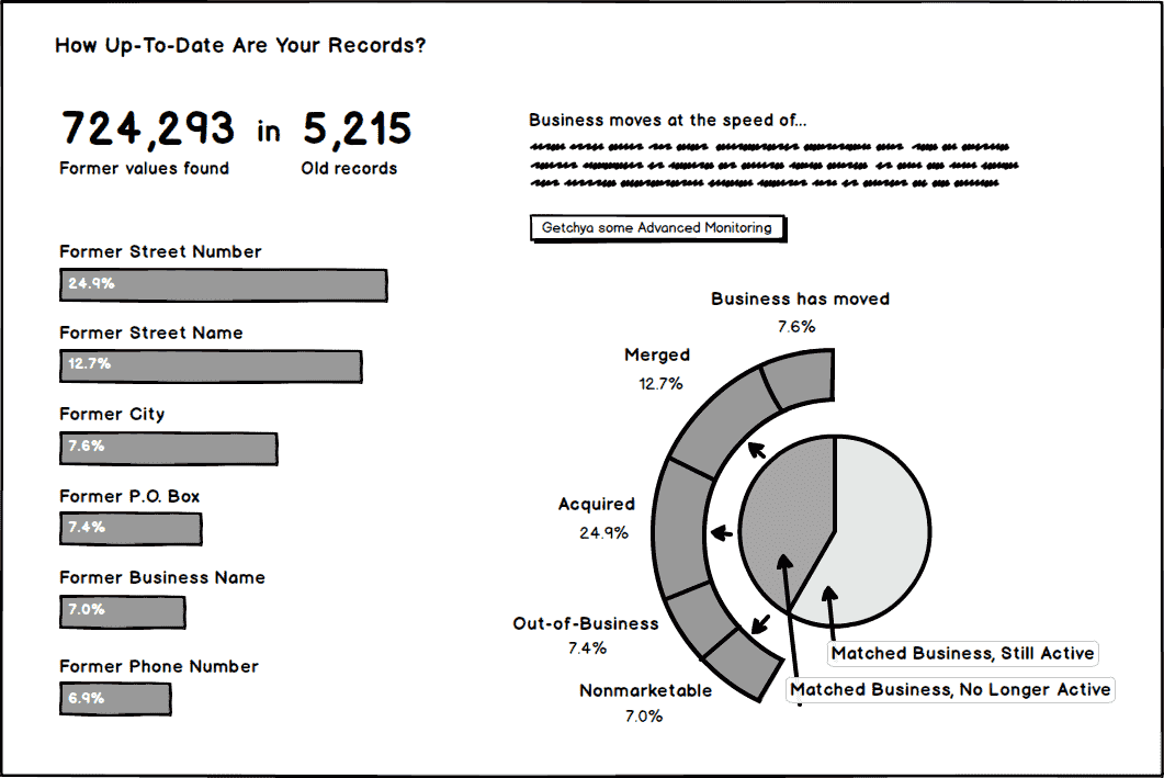
Data quality at the 10,000-foot view
Once we had the basic idea for a series of visualizations, I came up with a series of high-fidelity mocks from which we could code our interactive data quality dashboard.
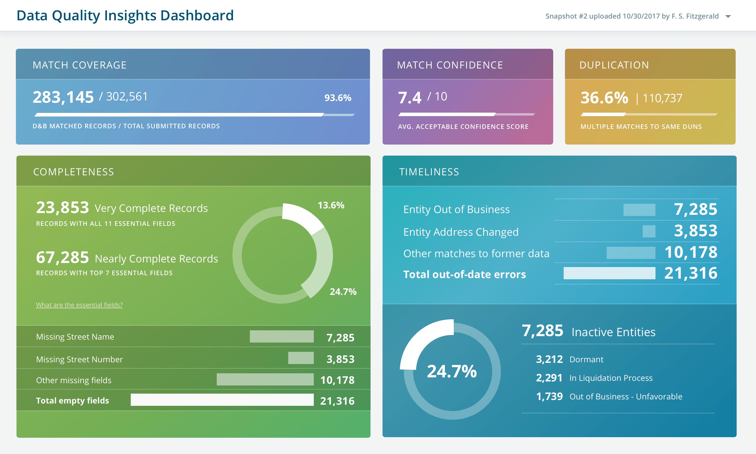
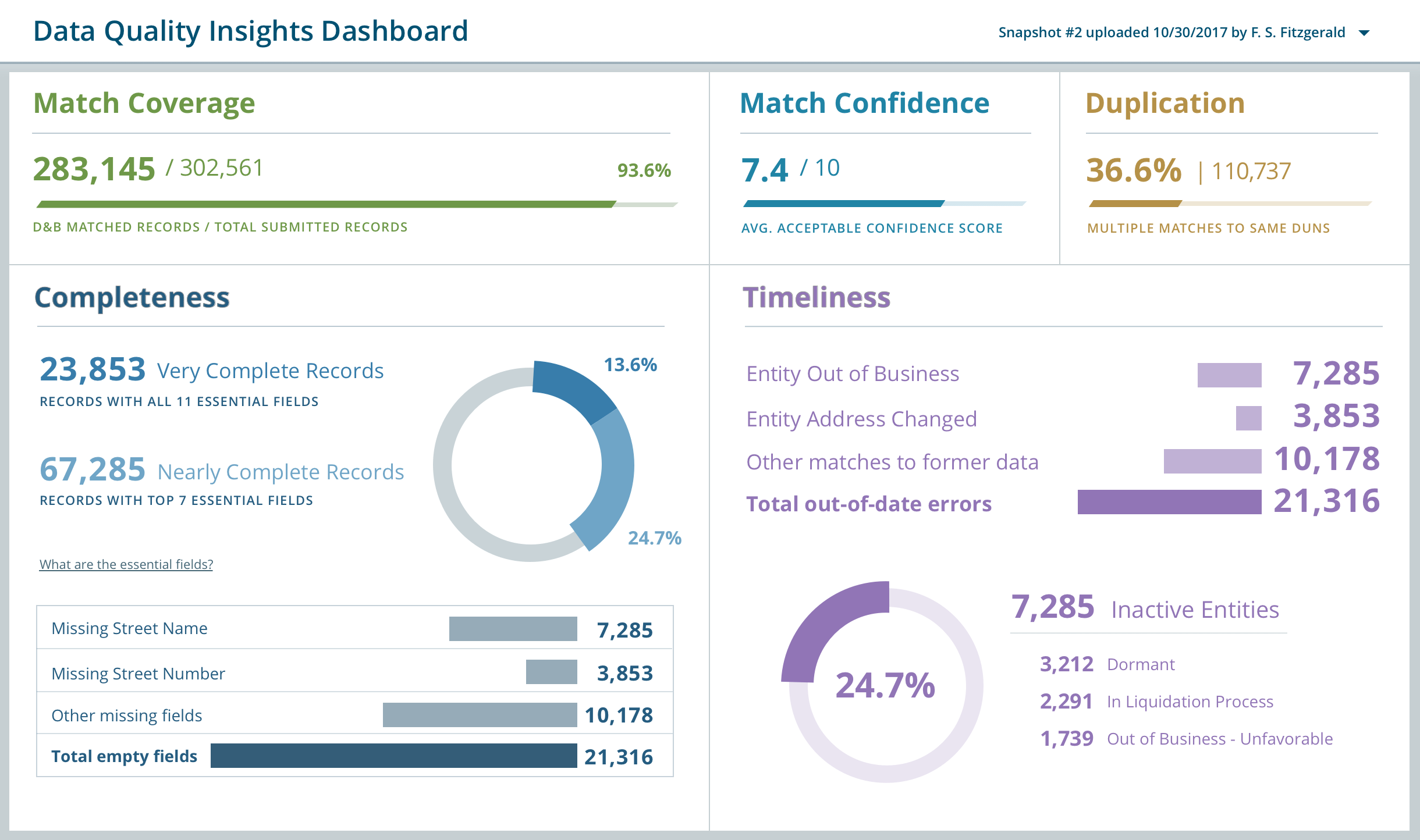
Once we picked the design, I built the dashboard in Vue, using animated SVGs and ChartJS graphs to display the data on the client at runtime.
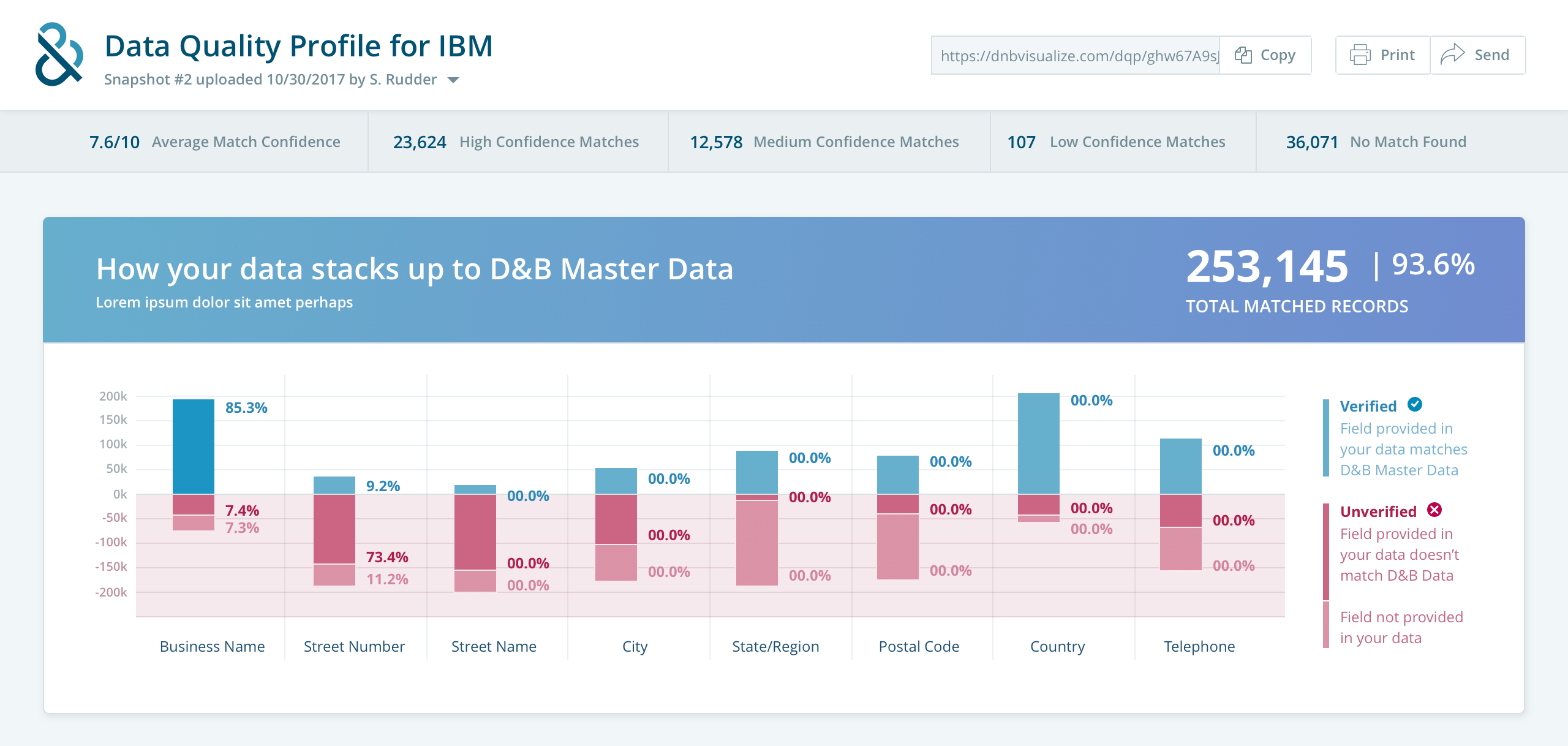
A detailed data quality report
Part data profiler, part marketing brochure, the insights report was a custom-fit interactive experience.
There was far more to share about the customer’s data than just what the dashboard could display, so I built an in-depth reporting tool in the same style.
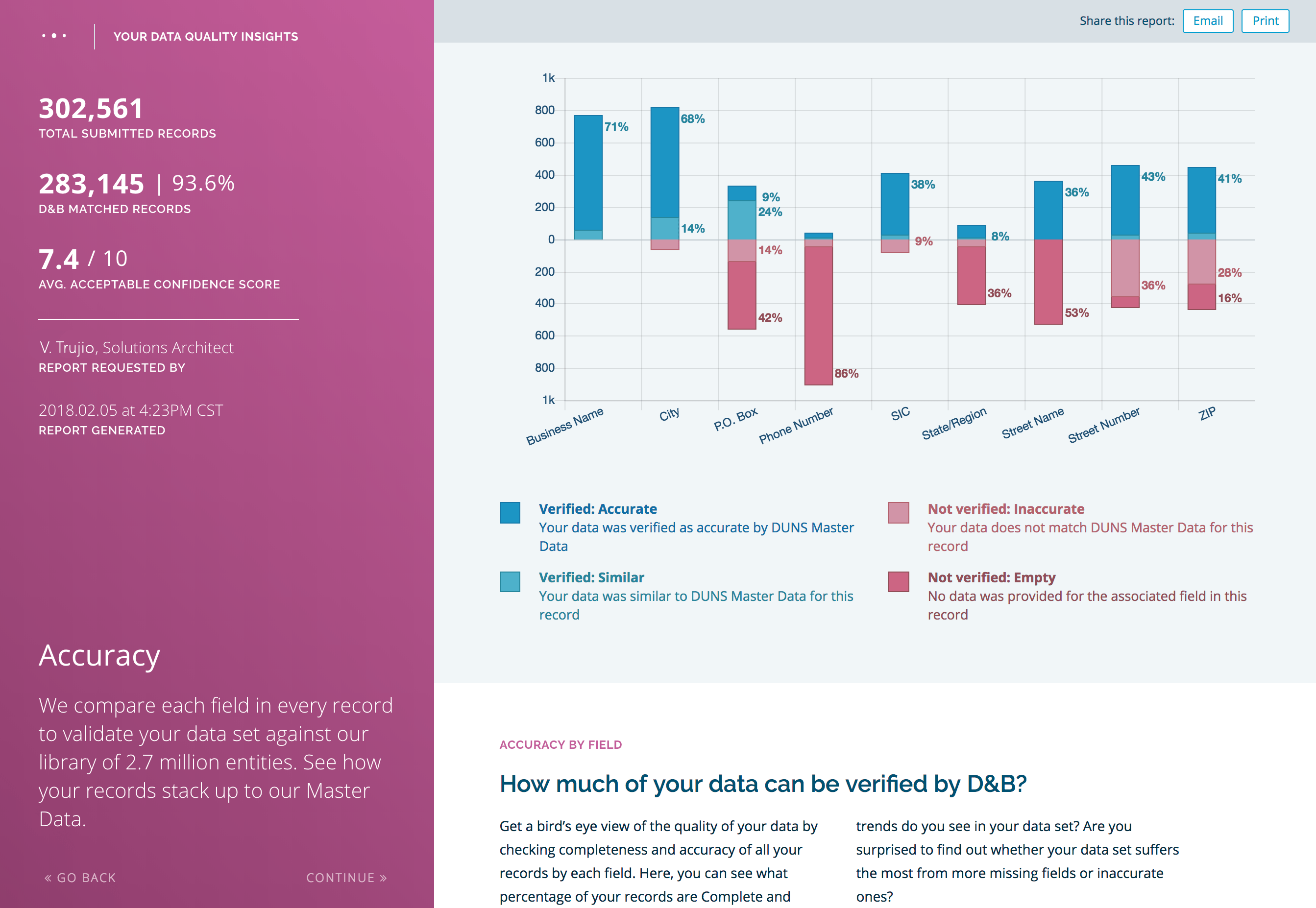
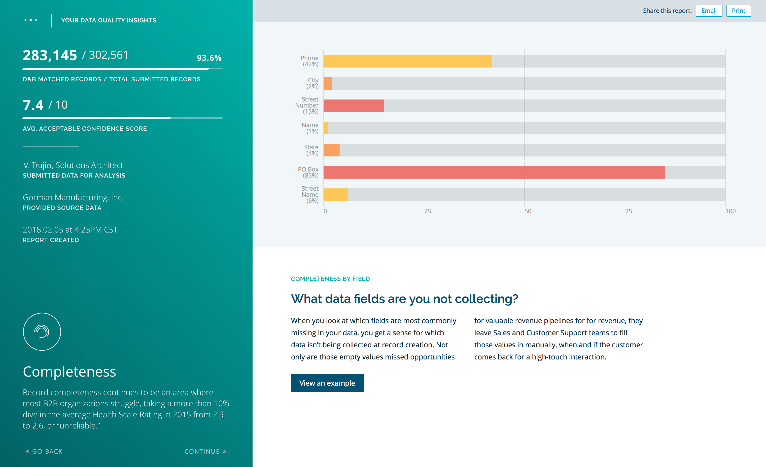
Like the dashboard, I developed this in Vue.JS with animated SVGs ChartJs. I also included a special print stylesheet so that customers could save and share a clean, well-formatted PDF of their report.