Reintroducing Cloud.gov
When I first joined Cloud.gov, the infrastructure was strong, but the product story wasn’t.
The Cloud.gov Platform-as-a-Service (PaaS) had served federal agencies for nearly a decade without a dedicated product or UX designer. Over time, the program had accreted multiple public interfaces, forgotten landing pages, technical documentation, and institutional history.
The website in particular had become a junk drawer of release notes, incident reports, compliance documents, developer blogs, and support articles. The Federalist product and its website had been hurriedly renamed "Pages" and then dropped in as an afterthought, both in brand concept and in website organization. The website's homepage invited visitors to spin up a free sandbox — eventually — but it didn’t guide agencies through evaluation or procurement, or even surface a way to reach out to our sales team.
Cloud.gov's brand and website didn't support the authority and professionalism our customers have come to know us by.
The challenge
Clarify the identity of a federal cloud platform without erasing the engineering culture that built it.
Re-drawing the product ecosystem
I started by clarifying the relationship between Cloud.gov (the PaaS) and Cloud.gov Pages (static site hosting offering) and reframed them as part of a coherent product family, especially as we prepared to welcome a third offering (Cloud.gov Workshop) from a recent team reorganization.
To facilitate our working relationships across TTS, I art directed the sub-brand work, working with multiple brand designers and the product teams. Leadership anticipated continuing to expand Cloud.gov's offerings, and so it was important to leave the door open for new brands to slot in, with room for their own identities.
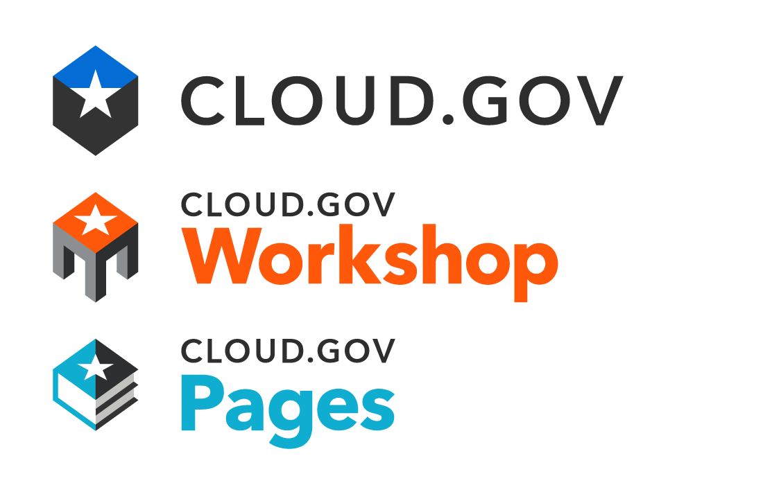
To do that, we've kept the recognizable star knockout and the roughly hexagonal silhouette, but adapted the shape metaphor and chose a particular accent color for each product offering.
Though more subbrands have not yet been publicly announced, we have successfully tested the elasticity of this model, and feel confident that the Cloud.gov brand can expand with the demands of our customers and platform.
Building for government without the red tape
Cloud.gov’s voice had drifted over the years. Engineers wrote carefully but inconsistently. Some sections still echoed early 18F founder language long after Cloud.gov needed its own identity.
I worked directly with Cloud.gov leadership to define how we describe security posture, procurement models, and product scope, then translated those decisions into navigation and hierarchy. We went with a solutions-first, not product-first, strategy, so that we could continue to expand and adapt as we plan to support more digital needs for federal agencies.
I wrote a voice and tone guide that emphasizes clarity and authority, then drafted portable talking points for common situations. Then, I wrote and structured the full marketing site content to that standard in collaboration with procurement, sales, security, and DevOps stakeholders.
“Cloud.gov helps government agencies buy, build, and authorize modern cloud services.”
“Government agencies have a mission to accomplish — and most of the time, technology itself isn’t the mission.”
Nobody wants to be the only website maintainer, so I documented how contributors can update content or create new pages easily. The Astro site functions as a lightweight CMS: Markdown drives the content, structured data controls the estimator and other secondary information, and a clean component model allows our team to build with composable patterns that don't rely on one-off mocks.
In addition to accelerating publish timelines, this keeps Pull Requests small and targeted, so contributors and reviewers can focus on accuracy and clarity instead of wrestling with templates or manually testing unrelated pages. As we add offerings or balance our prices in the future, we can adjust our content with a simple PR.
A design language purpose-built for government technology
As a federal program without a recurring stock art budget, we couldn’t rely on a handful of public domain images forever.
Instead, I designed a composable illustration system built from scalable geometric elements, consistent spacing logic, and defined color relationships between products. Instead of locking our team into trying to get permission to purchase stock images each year, the team can assemble infographics, diagrams, and supporting visuals within a shared visual language, confident that they will scale with the application.
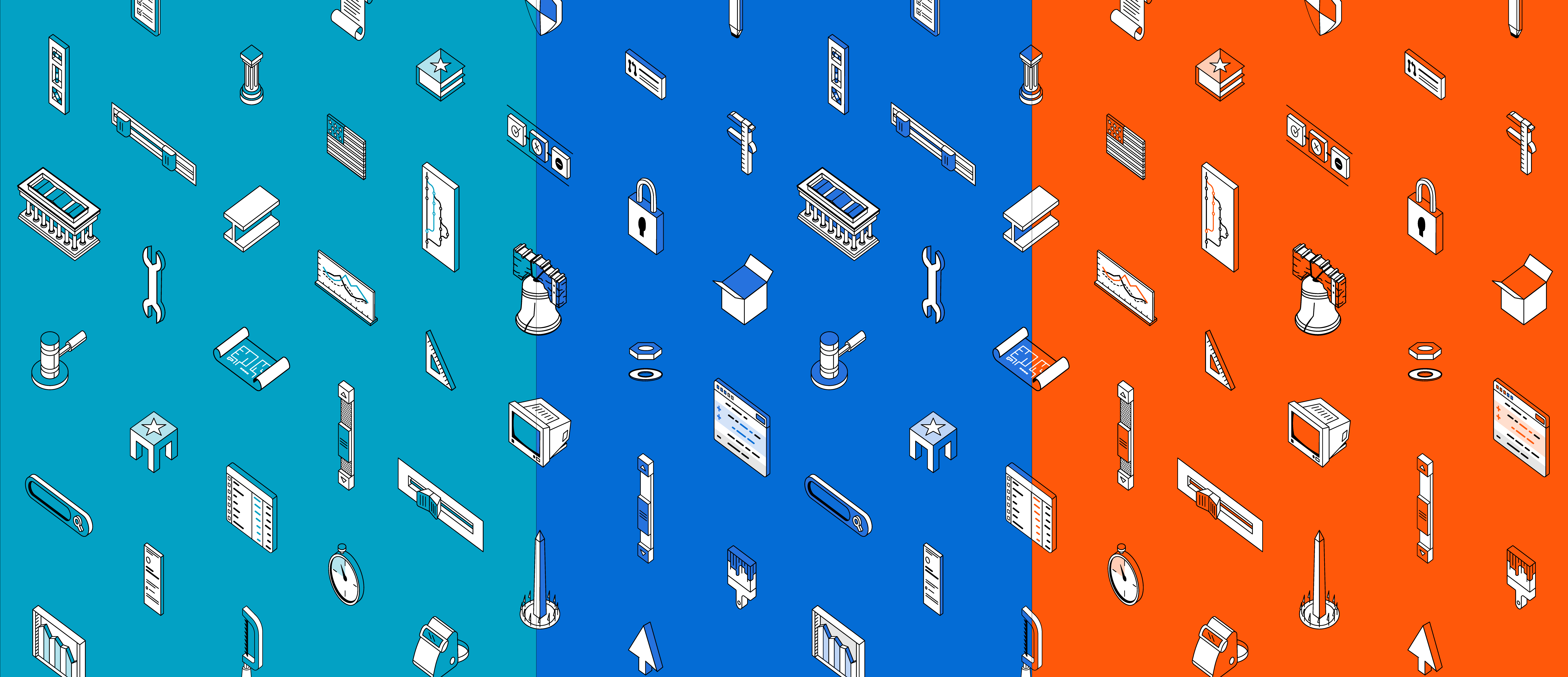
To keep the visual style from blending into generic isometric icons or drawing attention away from the content, the Cloud.gov illustration library contains multiple nods to recognizable federal elements like the GSA building signs, well-known D.C. landmarks, and even PIV cards. The design assets made from this library feel purpose-built for government, but not flashy; just like the rest of the Cloud.gov family.
“A design system shouldn’t increase the product's dependency on a designer.”
Ultimately I aligned brand, typography, illustration, and color usage across:
- Marketing & documentation pages
- Console and Pages UI surfaces
- Transactional and marketing emails
- Executive slide templates
- Team swag and internal resources
More importantly, I built the brand and illustration system to survive turnover. TTS hires most of its federal employees under 4–8 year limited-term appointments, so staffing changes are always inevitable. When roughly 75% of TTS staff departed in 2025, that reality sharpened quickly. I needed to deliver a durable, flexible design language that wouldn't rely on polish to carry the work.
Division and subtraction
The prior Cloud.gov website made it difficult to audit content for accuracy or relevance. Technical guidance, marketing claims, and institutional history lived side by side without clear boundaries. When security language changed, it required my teammates to hunt across unrelated sections. Navigation tweaks for docs often broke layouts for the marketing pages.
It was clear that I needed to reduce the surface area. After auditing more than 260 URLs, I split the monolithic site into docs and marketing.
I identified which URLs should get moved into a new Docusaurus instance, which could be managed and updated without influencing the marketing site. This kept the engineering documentation GitHub-driven, and preserved Markdown workflows so engineers could continue writing and publishing docs the way they always had.
Technical guidance, API references, and compliance detail now live where engineers expect them to live, with a purpose-built experience. And I made sure to set up and validate redirects to the new 245 documentation URLs, so that our customers' bookmarks wouldn't drop them on a 404 page when we coordinated the launch across sites.
In parallel, I redesigned and rebuilt the marketing site in Astro.
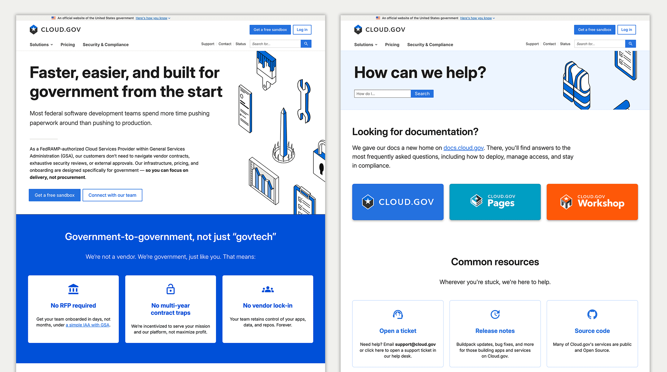
I structured the new marketing site as a composable, content-driven system that still relies on Markdown but enforces consistency while allowing for adaptation. Instead of freeform HTML inside templates, contributors configure frontmatter schemas that are familiar across pages.
By decoupling the marketing and docs content, both were easier to navigate and update.
After soft-launching and testing the docs site for more than a week, we published the new website, replacing more than 56,000 lines of code with about 13,000, then followed with coordinated updates to our logged-in experiences and emails.
Building alignment without breaking trust
By the time I started the rebrand effort, our platform engineers had carried Cloud.gov's identity strategy for ten years.
They felt strong ownership over the platform content and structure they had cultivated. Instead of limiting their contributions, I built foundations that made their efforts more sustainable and less brittle, and once the weeds were cleared, they became enthusiastic about revising the docs content to reflect the latest platform experiences.
Naturally, not everyone agreed on how prominently to feature certain offerings or how directly to push sandbox signups versus sales inquiries. I facilitated working sessions with leadership to clarify audience goals and then translated those decisions into navigation and layout changes, circulating amongst the team for specific feedback.
I'm proud that the final structure reflects our team's shared priorities, not my unilateral design preference. We launched a brand and identity that the whole team recognizes themselves in.
I'm even more proud of the way I translated our strategic positioning decisions into IA and content management choices so the structure can hold even when opinions change (and if there's one thing I've learned from working in government, it's that opinions do change).
Cloud.gov shouldn’t have to settle for a tradeoff between polish and practicality. A design system shouldn’t increase the product's dependency on a designer. Now, the aesthetic supports the system, and the system supports the people maintaining the product.