Emails designed to ruin email for good
After a few years at the Bay Area start-up Asana, I took an unpopular opinion in defense of emails.
At the time, the hundreds of thousands of system-generated emails sent every weekday had been assembled by some of Asana’s earliest engineers and then rarely touched. There’s a big culture around “dog-fooding” the Asana app among Asana employees, which makes sense — we’re more likely to notice bugs and want to fix them if we have to use the app every day.
Unfortunately, that dog-fooding didn’t extend to the Asana transactional emails — the emails that are sent whenever someone comments, assigns, or edits a task you’re following.
In 2015, more than 90% of Asana employees had intentionally disabled the Asana email notifications about their tasks and projects.
Back then, most of the company didn’t even consider email a real part of the Asana product experience. And it’s quite true that if you’re using the Asana app regularly with your team, you really don’t miss working in email.
But most employees didn’t realize that the majority of Asana customers still had the default email notification settings, which means most users hadn’t yet fully transitioned off email, or were filtering their Asana emails to trash. When I heard about the disparity over a complimentary lunch in our sunny 7th floor cafeteria, I knew I had to do something.
The challenge:
Turn a productivity killer into a touchpoint for engagement.
If you’ve had the misfortune to work on HTML emails, then you’ll know why they’re often the hot potato of marketing and engineering teams.
They’re famously difficult to get to look consistent across multiple devices and email clients. One wrong character can wreck the entire layout, and there’s no undo or pushing up a new version. The smallest mistake can land you in spam purgatory, and the biggest ones lead to data breaches that shake customer confidence.
But sometimes, we do the hard, frustrating, thankless thing, for the sake of our users.
The Asana transactional email experiments in 2015 were my labor of love.
Email may have been unofficially declared the enemy of productivity around Asana conference tables and OKRs, but the majority of our customers experienced this blight on their way to becoming the kind of users who ultimately depend on Asana, not email, to track their work.
I wanted to speed our users on their journey, even if it meant wading back into the murky world of email our team had already transcended. I believed that if we meet our current and future users where they were — currently managing their work via email — and showed them a better way, then they’d be more likely to trust Asana with their work communication.
The experiment: an email meant to help people get out of their inbox
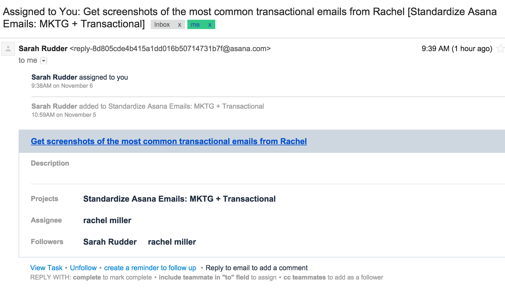
There were a lot of issues with the product emails at the time. They were hard to scan and they didn’t match the current Asana app or branding. They didn’t always thread properly. They didn’t clearly indicate what had changed. There wasn’t an obvious or even implied action to suggest the user jump back into the app. Most of all, they felt like they were generated from some dark, forgotten system, instead of initiated by someone on your team.

To get the most signal, I tackled the 4-6 million update emails per week that users generate for each other by assigning, commenting, adding attachments to, and completing tasks.
Designing the experiment
I targeted an increase in the overall number of email opens and clicks back to the Asana app by at least 10%, which would in turn influence how many, and how quickly, new teams came to rely on Asana.
Among other goals, I expected an increase in the proportion of users turning off email notifications altogether as they began relying on the Asana Inbox to stay in touch with their work. (Have you ever thought of total unsubscribes as a success metric?)
For comparison, previous experiments and A/B tests were generally considered a "win" if they made at least a 5% improvement in core metrics.
I set some limits around exactly what we’d change in the test variations:
-
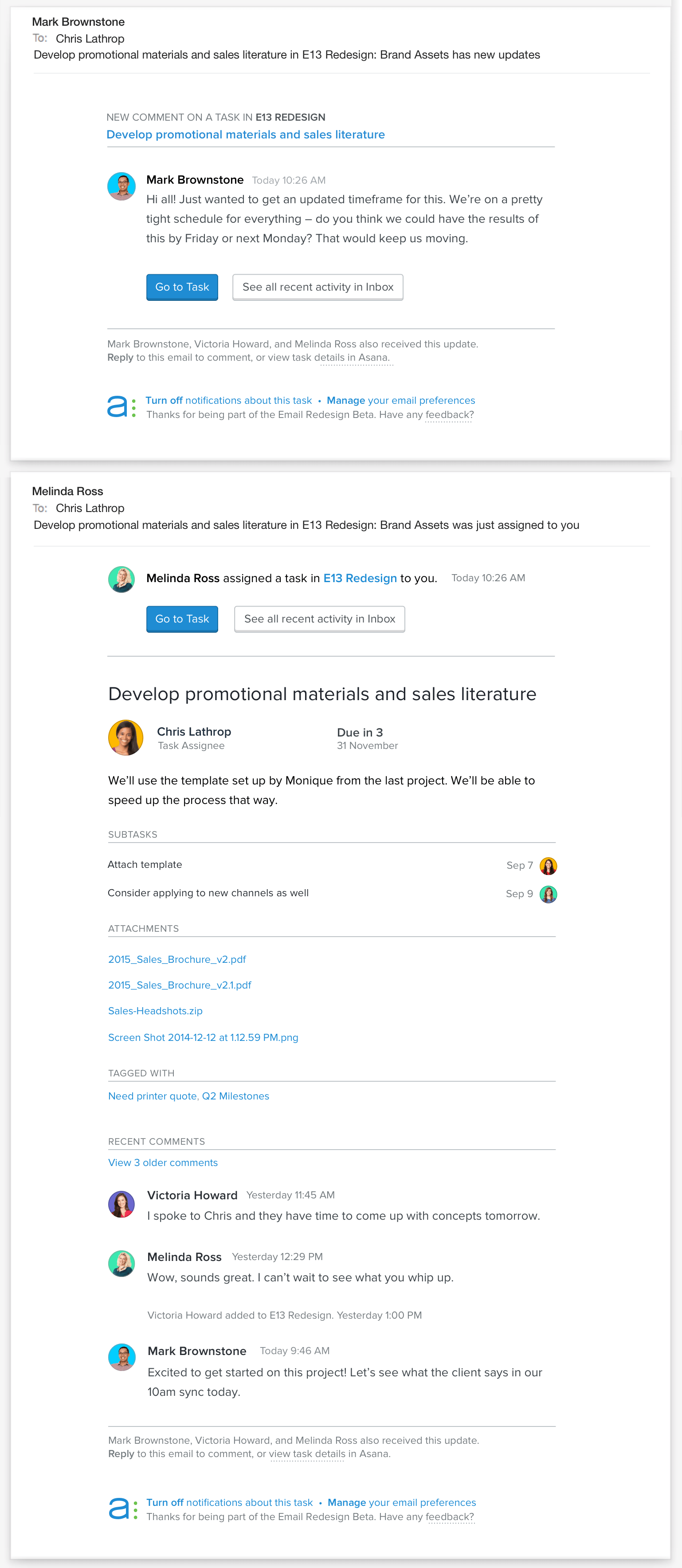
Provide awareness, but not overwhelming detail. I decided to test two layouts in place of our existing single layout email — so now we’d send either an introduction email or an update email. After receiving the first email with all of the task details, followers then received only the new information in any subsequent emails about the same task.
-
Enable users to effortlessly resume their task. For new users, notification emails are crucial prompts to collaborate with their team within the app. The test designs prioritized distinct CTA buttons to direct users back to the relevant task as well as their "Asana Inbox" -- an in-app feed of all notifications
-
Make it clear who else is "on the thread". In the Asana app, you can see users who follow a task in real-time, but with emails, you see just a snapshot of the task. Unlike email, current task followers‘ email addresses aren’t explicitly listed in the CC field. The test brought in conventions like avatars, timestamps, a list of followers to help the emails feel more personal than a boring system update, without risking a reply-all apocalypse.
-
Earn trust with a professional and clear design. Communicating by email with external vendors and other organizations was still a key workflow for many users, and we needed to be reliable, approachable, and clear. Even with a brand redesign on the horizon, it was important that Asana emails treated work correspondence professionally.
-
Don’t break any workflows or surprising any users with suddenly different layouts that may not end up being permanent. Instead, we invited current to invite users to participate in an email beta with the option to disable or enable the new notifications as they liked. They also provided write-in feedback about the variations.
This is the original 2-part test:

What We Learned
After the two-month experiment, we were shocked at the results:
- Users were 36% more likely to open the test email than the control.
- The total number of clicks through to the task rose by 50%.
- Users were 9% more likely to disable email notifications, paired with a similar increase in the in-app Asana Inbox usage.
- New teams using the test emails were 33% more likely to ultimately become Asana Premium (paid) users.
The results of this small test were wildly positive — one of the most positive experiment results we’d ever ran. No one had even considered that this email test would impact the hardest-to-nudge metric for any company — paid user growth.
Why we didn’t just ship one of our biggest experiment wins
At Asana, we tested these ideas to learn, not to carelessly sidestep the whole design process in the name of “agile development”. The redesign of a such a varied experience — especially the technical challenge of coding for situations behind enemy lines in email clients, without any of the typical product design conventions — can’t be evaluated in a vacuum.
The worst thing we could have done was assumed we’d figured out how our email notifications should work, declared a victory, and moved on to the next interesting task.
Celebrate the try, not the triumph
Something we cultivated during my time at Asana was “willful intention without attachment to results”. I’ve also heard this phrased around the lunch table as “strong opinions, weakly held.” There’s a spirit of trust and fearless curiosity that permeated every team at Asana, making us quick to jump in and slow to find blame. This core value has stuck with me long after my tenure at Asana ended.
So even in something that looked like a landslide victory, we remained intentional and iterative. The emails generated in the Asana app today are descendants of not just this experiment, but many other tests and revisions.
I predicted that time spent on the emails would be well worth the effort, and our experiment bore that out, securing emails as a cornerstone of the following year’s product development goals.
By the time I left Asana and the San Francisco Bay Area in early 2017, product notification emails had become a major influence in the adoption of the Asana mobile apps. Because of these experiments, product leaders began to rally around emails, not as an enemy, but as an avenue.